https://www.bbc.co.uk/news/science-environment-67017021
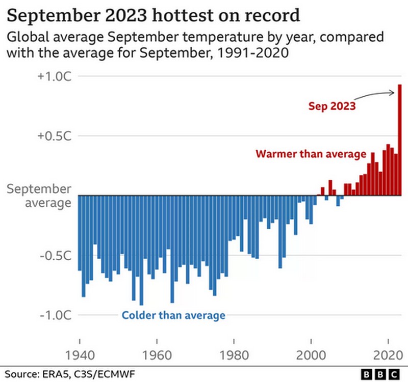
Unfortunately the included graph makes things seem better than they are.

The graph shows the average line between 1991-2020, but the actual temps are from 1940. Move the average line to those between 1940 - 2020 and a lot of the blue bars from just after 1980 turn red. It makes those now shown in red even worse.
It's a fix to make us feel good about things. We are going to hit 1.5°C promised by COP21 in Paris in 2015 a lot earleir than the end of the century.
