Sometimes Press Climate reporting really irks me
Reading this BBC article on how Cars and Coal have helped drive CO2 growth this year, I find the lack of any length of data a little irritating. Never mind the fact that the actual graph would not tally with the article at all.
The show this image with growth in billions of tonnes per year.

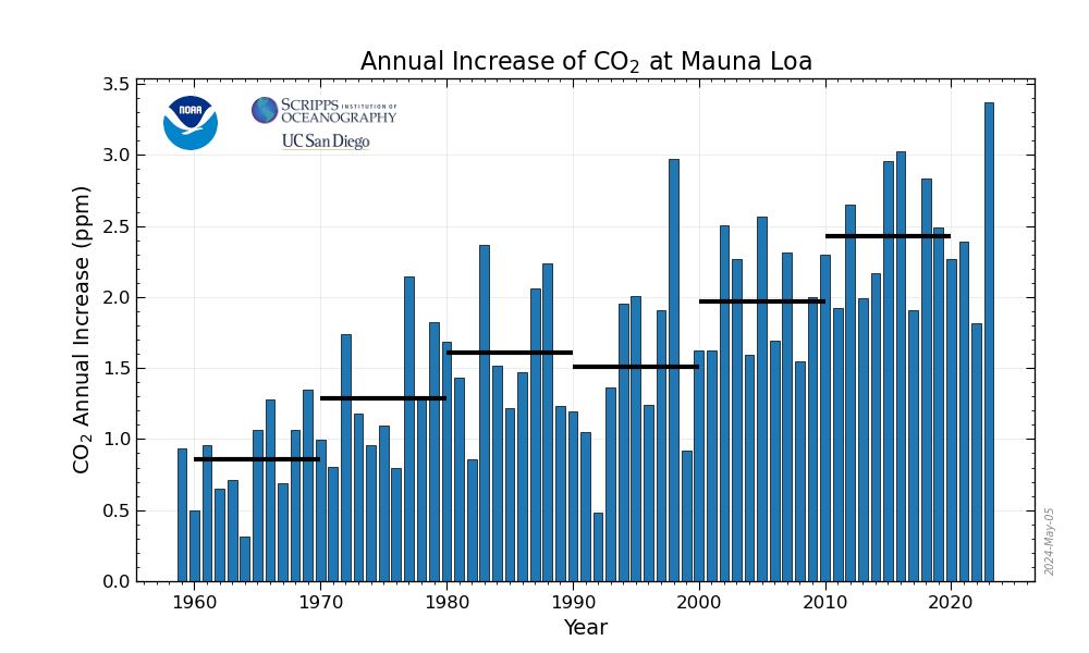
So it looks like we're getting a handle on it, after all it is not really growing that fast now is it? Until you see the non smoothed figures on which they are basing this. The next image is in ppm (parts per million growth of CO2), per year.

Which seems to match what they are saying, 1.7ppm for 2017 right?
Except that chart comes from Mauna Loa (Hawaii), there is a global set of figures, but they don't have a chart. So I made my own.

Does that really look like we are in control and it's just 2018 which is out of control???
Nope, didn't think so.
And so, there again, I am left irritated by an attempt to communicate the seriousness of Global Warming. Yet again they miss the point and fail to tell people how truly BAD it is.
The show this image with growth in billions of tonnes per year.

So it looks like we're getting a handle on it, after all it is not really growing that fast now is it? Until you see the non smoothed figures on which they are basing this. The next image is in ppm (parts per million growth of CO2), per year.

Which seems to match what they are saying, 1.7ppm for 2017 right?
Except that chart comes from Mauna Loa (Hawaii), there is a global set of figures, but they don't have a chart. So I made my own.

Does that really look like we are in control and it's just 2018 which is out of control???
Nope, didn't think so.
And so, there again, I am left irritated by an attempt to communicate the seriousness of Global Warming. Yet again they miss the point and fail to tell people how truly BAD it is.